Unlike e-commerce platforms or news portals, manufacturing websites operate under stricter content requirements and higher design standards.
The reason lies in the density of information: technical specification tables, SKUs, part numbers, dimensions, compliance standards, and performance metrics.
Users constantly switch between reading modes - first scanning general information, then diving into detailed numerical data. If the typography fails to support this cognitive load, characters blur together, numbers become difficult to distinguish, and the page turns into visual noise. In such cases, clients leave not because the product is unsuitable, but because they cannot efficiently find the information they need.
Moreover, typography is perceived before the content itself is processed. When a website's type system appears precise, structured, and technically balanced, visitors subconsciously associate those qualities with the company's processes, documentation standards, and execution accuracy.
For this reason, within the context of manufacturing website development, font selection becomes a component of user experience architecture rather than a purely aesthetic decision.
Functional Typography for Manufacturing Websites
A functional typeface for a manufacturing website must perform equally well in two polar contexts: a 300-word equipment description and a single table row containing six numerical parameters. This requires a high x-height, clear differentiation between similar characters (I, l, 1; O, 0), and stable legibility when scaled down on mobile devices.
In dense product catalogs, the typeface must not 'bleed' or lose definition — every character should maintain structural clarity even at 12px. Precision at small sizes is not a stylistic preference but a usability requirement, particularly when users compare specifications line by line.
Beyond readability, a well-chosen type system allows the page to be structured without relying on excessive visual separators. Marketing narratives and technical specifications can be perceived as distinct informational layers purely through variations in weight, size, and spacing.
This reduces cognitive friction: users instantly recognize where value propositions are presented and where numerical data begins. In manufacturing environments, where decisions depend on accuracy, such clarity directly influences engagement quality and conversion performance.
Top Font Choices for Manufacturing Websites
The choice of a font pairing determines how quickly a client can find the required model in a catalog and how easily they can read the specifications. Below are five combinations tailored to different tasks and manufacturing segments.
Inter + Inter
Inter was originally designed for interfaces with high information density, and this is particularly evident in its handling of numerical data. Its optimal x-height and carefully calibrated letter spacing make it highly reliable when reading SKUs and complex numerical specifications — even at small sizes, digits remain distinct and do not blur together. In catalogs featuring thousands of items, this level of clarity is critical.

Using a single typeface across multiple weights is a logical solution for websites with extensive product structures. Bold weights anchor headings, Regular performs well in descriptive text, while Light or Medium can be effectively used in tables. The visual system remains consistent and cohesive, without excessive contrast — which, on technical pages, often creates distraction rather than clarity.
IBM Plex Sans
This typeface was specifically created for technical content, which gives it a distinctly 'engineered' character. Its primary advantage lies in the uniqueness of each glyph: the capital 'I,' lowercase 'l,' and numeral '1' are clearly distinguishable.
Such precision communicates discipline and expertise, reinforcing perceptions of reliability and accuracy even at the stage of reading specifications. For manufacturers of CNC machinery, precision measurement instruments, or complex electronics, this functions as a non-verbal signal — a company that structures information with this level of clarity is likely to apply the same rigor to its production processes.
Montserrat + Public Sans
Montserrat is a geometrically stable typeface with a strong visual presence. In headings, it conveys solidity and reliability — qualities that align naturally with mechanical engineering or metalworking sectors. Public Sans, serving as the body typeface, ensures neutrality and high readability in descriptions and tables without competing with the headline for attention.

This pairing effectively separates content layers: Montserrat carries the marketing tone, while Public Sans delivers informational clarity. As a result, users intuitively understand where to read about value propositions and where to focus on technical data.
Archivo + Roboto
Archivo is a compact typeface with a technical geometric structure. Its narrow proportions allow long model names and category titles to fit on a single line without wrapping — an important advantage for websites with extensive product catalogs. Roboto, used for body text, is a practical and predictable choice: it renders consistently across devices, loads quickly, and maintains strong legibility at small sizes. This pairing is particularly suitable for manufacturers of packaging, consumables, and products with frequently updated assortments — where maximizing the amount of useful information above the fold is essential.
Sora + Inter
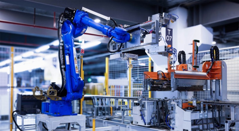
Companies operating in robotics and systems integration often aim to differentiate themselves within a traditionally conservative market. Sora, with its wide proportions and distinctive letter cuts, conveys a progressive and technological character. When combined with the functional clarity of Inter for body text, this typographic system creates the image of an innovation-driven manufacturer actively implementing IT solutions and automation. It serves as a visual confirmation that the company operates in alignment with Industry 4.0 standards.
The right font choice in manufacturing website development transforms complex product catalogs into an efficient working environment. All five font pairings address the same core objective: making large volumes of complex data intuitively understandable.The difference lies in strategic emphasis, defined by business specifics — whether it is maximizing table readability, clearly separating content layers, or positioning the company as a technological leader.